"Simplicity is virtue" - IKEA
During the class presentation about design, what came up in my mind at first was IKEA. It is the place where I imagine things like children and sells design with values. IKEA is not just products but more than services and experiences for me, and for all the customers. IKEA combines design and marketing successfully and realizes the true value of customer insights by design. I always remember the experience that I had in IKEA more than just furniture shopping or fancy products. I researched about IKEA after the class, and I could understand the design philosophy that IKEA tried to realize and more interesting facts behind its brand.
The concept of IKEA can be well explained by the 5 guidelines of design that was given from the class presentation. IKEA is usually described as designing for majority. It’s easy, simple and affordable for ordinary people. They do this by design. The principle and fundamental idea of IKEA starts from the philosophy of IKEA’s CEO Ingvar Kamprad , which is ‘providing cheap furniture with design’. Furniture was regarded heavy and expensive stuff that only rich people could afford in the past, but IKEA came up with simple idea to sell cheap furniture in the paper box for everyone. The design philosophy of IKEA is being minimalism, bright, simple , practical, reasonable with ‘cheap price’. With this basic philosophy, IKEA sells not just solid product but the lifestyle and new values of living. This philosophy can be seen in every steps from manufacturing, designing, packaging to marketing. They minimized cost of shipping and installing furniture, and assembling every pieces. Despite the fact that customer have to put their effort to assemble every pieces for final furniture, consumer still prefers the way it is and pay for their simplicity and design. It stimulates customers’ desire for designing their life space in their own way, and IKEA is successfully satisfying the customers. IKEA is more than just creative products, and space itself generates imagination and experience.
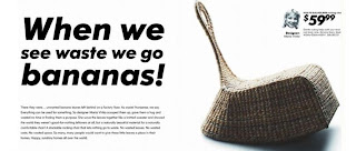
To cut down more cost, they use recycled material and turn them into valuable product by design. They even made a chair with banana peels. They consider customer experience and environment. This is what brings a company business success and social benefit together.
IKEA changed the idea of furniture that most of the people have. Big to small, heavy to light, dark to bright, and hard to easy. They design furniture based on the function and situation of its use with minimum design. Furthermore, it sells values and lifestyle included in the design of the furniture. People imagine about products being in their room, and furniture becomes imaginative tool not just huge decoration. Also, the interesting thing that I felt about IKEA design is that they put name of the designer on the tag of each product. Designers feel proud of their final works, and feel responsibility on their products and value of themselves as designer.
As it is said above, IKEA design well suits with the idea that the good design is for majority, simplicity and designing to empower and being universal design. There is a saying that once the CEO of IKEA at Sweden said, “Beautiful design with expensive product is very easy, but beautiful design with cheap and practical product is more difficult and challenging”. Design starts from honest concern about people who use it, and I understand that customer insight is basis for designing. From the class presentation on Monday and my case study of IKEA, I learned that value of design is from true consideration of the purpose of design. Also I felt that someone’s design philosophy can be powerful enough to generate positive value to people.


Jina - Really good first post. I think the IKEA example is a great one. I'm glad you brought something personal into the topic and you explored it well. My only suggestion is that you write a bit more in future blog posts - this one is right on the edge of the minimum length requirement (see the syllabus for more on this). Good job!
답글삭제